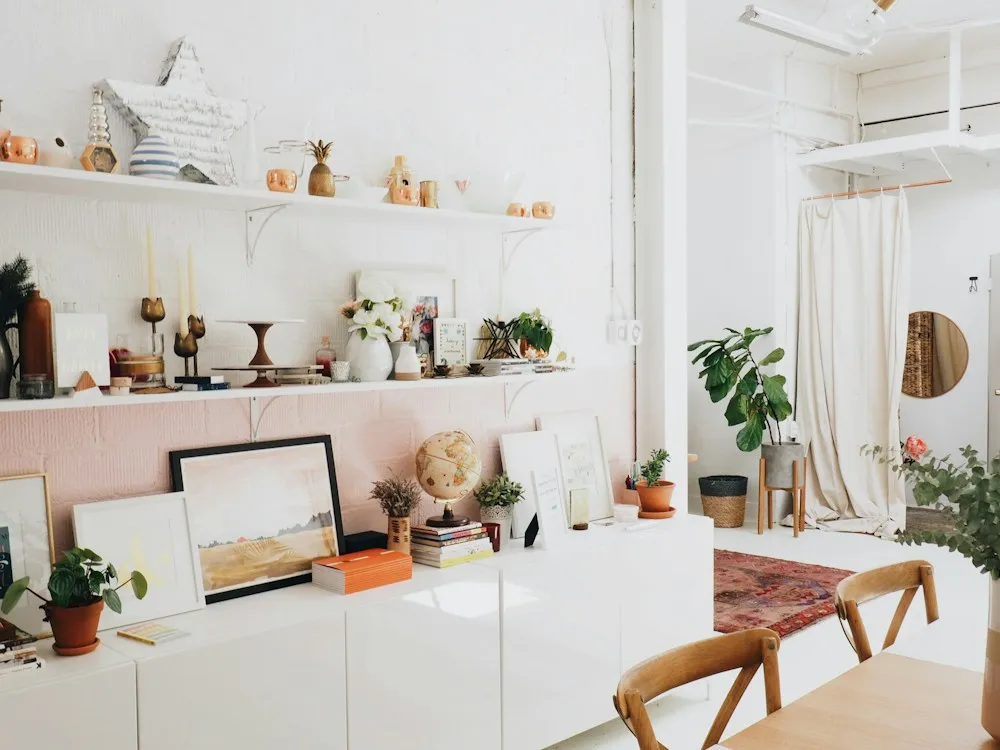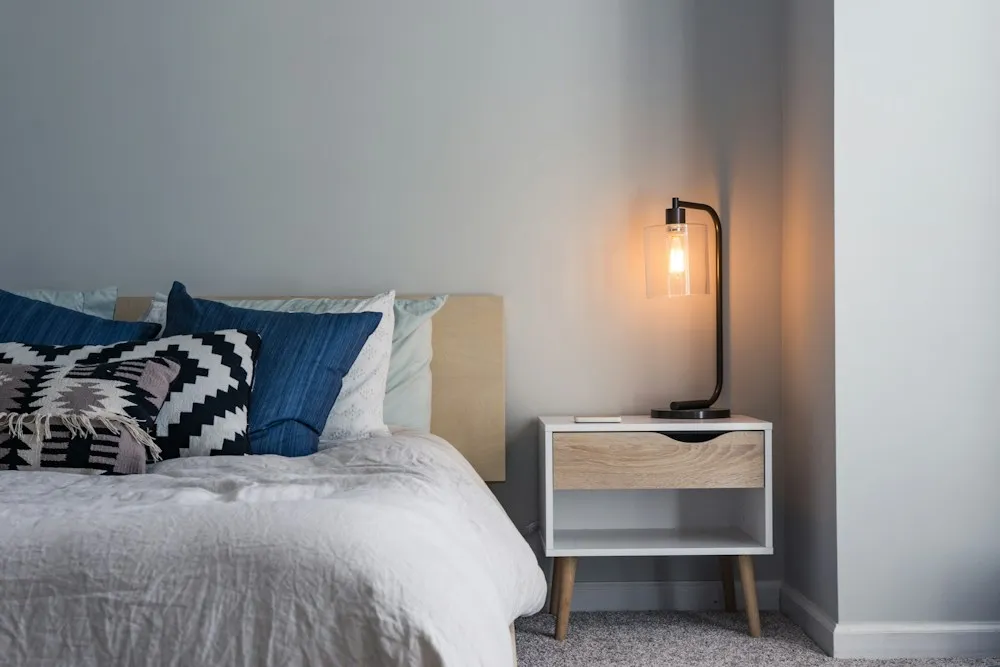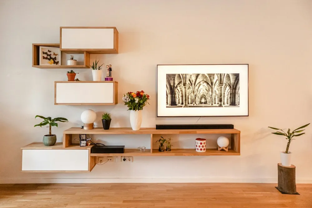
A client in Northeast Portland had done everything the internet told her to. Sixty percent warm white on the walls, thirty percent olive across the sofa and drapes, ten percent rust and brass in the cushions. The palette was genuinely good. The room still felt like the waiting area of a nice dentist, and she had been buying pillows for eight months trying to fix it.
The 60-30-10 rule is not wrong. It is a rule about color, and color is almost never why a room fails. In eleven years of walking into rooms people describe as unfinished, the same three things are wrong, in roughly this order of frequency, and none of them are color.
Failure one: all the light is at one height
Stand in the room at nine at night and count the light sources. If the answer is one and it is in the ceiling, you have found the problem. A single overhead fixture lights the floor and the tops of things, leaves the vertical surfaces dark and puts a shadow under every face in the room. It is the lighting design of a parking garage.
Light belongs at three heights. High, above roughly 70 inches, for general wash. Middle, between 30 and 60 inches, which is table lamps and sconces and the layer that makes a room feel inhabited. Low, below 30 inches: floor uplights, a lamp on a stool, candles. Every bulb in one room should be the same color temperature, and 2700K is almost always right. The full method, including the lumens a given room wants, is in the three-height rule.
If you do one thing this week, buy two lamps and stop turning the ceiling light on. Two $90 lamps at opposite corners will change a room more than $900 of anything else. That is the most reliable prediction in this article.
Failure two: the rug is two sizes too small
This is the most common single error in American living rooms, and it is almost always a pricing accident. Rugs sell by area, so the step from 8 by 10 to 9 by 12 is a third more money. People buy what they can afford, the furniture ends up floating around a small island of wool, and the room reads as a collection of objects rather than a place.
There are three rules and they are not negotiable.
- The front legs of every piece of seating sit on the rug. All of it, including the chair nobody uses. Back legs on the floor is fine. A sofa entirely off the rug with a coffee table stranded in the middle is what makes a room look like furniture in storage.
- Leave a consistent border of bare floor. Eighteen inches between rug edge and wall in a normal room, twelve in a small one, never less than eight. Consistency matters more than the number: a rug 20 inches off one wall and 4 off the other bothers people who cannot say why.
- The rug should run past the sofa at both ends, by six to twelve inches. An 84-inch sofa wants at least 96 inches of rug on that axis, which already rules out a 5 by 8.
Measure before you shop. Our guide to measuring a room properly takes twenty minutes and saves a return. Then read the size off this table.
| Room size | Rug size | Bare floor border | What it will hold |
|---|---|---|---|
| 10 x 12 ft | 8 x 10 | 12 in all round | Sofa and one chair, front legs on |
| 12 x 15 ft | 9 x 12 | 18 in all round | Sofa, two chairs, coffee table |
| 13 x 17 ft | 10 x 14 | 18 in all round | A sectional, or a sofa and a loveseat |
| 15 x 18 ft | 12 x 15 | 18 in all round | A full seating group you can walk around |
Between two sizes, go up. Slightly too large reads as generous; slightly too small reads as a mistake, and everyone sees it.
Two adjustments. Under a dining table, 24 to 30 inches beyond the table edge on every side, so a chair pushed back keeps its rear legs on. In a bedroom, 18 to 24 inches past the sides and foot of the bed, or two 2 by 6 runners instead, which is cheaper and often better.
If the right size will not fit the budget, layer. A large jute at the correct dimension with a smaller good wool rug centered on top costs less than the right rug in wool and looks deliberate rather than apologetic. See the Hawthorne and Mississippi Avenue rooms on the projects page.
Failure three: nothing at eye level
The band of wall between roughly 40 and 70 inches is where someone standing in the doorway is actually looking. In most unfinished-feeling rooms everything happens below 36 inches, then nothing until the ceiling. The room is furnished. It is just not inhabited at the height you see it from.
Four numbers fix this.
- Center art at 57 to 60 inches from the floor. Fifty-seven is the museum standard, taken from average eye level; use 60 with nine-foot ceilings. The center of the piece, not the top and not the nail.
- Scale art to 60 to 75 percent of the furniture below it. Above an 84-inch sofa that is 50 to 63 inches of art, far larger than most people buy. A 24-inch print over the same sofa is a whisper.
- Bottom edge six to ten inches above the sofa back. Closer and it looks stuck on. Further and the art and the sofa stop being one composition.
- Hang a group as a single rectangle. Lay it out on the floor first, keep gaps identical at two to three inches for small frames and three to five for larger, and center the whole block at 57 to 60 inches. Three small frames spread across a wide wall is not a gallery wall, it is confetti.
Art is not the only way to occupy that band. A tall mirror, open shelving, a leaning canvas, a plant that reaches five feet, a pair of sconces. What matters is mass on more than one wall.
Four things that separate a finished room from a furnished one
Leave something empty
Not every surface needs a tray. When a room reads busy rather than calm, it is usually because every horizontal plane is occupied. Keep one surface completely clear, and leave roughly a third of the backing visible on open shelving. Negative space is what makes the things you did put out look chosen.
Repeat every material at least three times
One brass lamp is an accident. A brass lamp, brass cabinet pulls and a brass picture frame is a decision, and a room reads the difference instantly. The same goes for black metal, walnut, rattan, worn leather, unglazed ceramic. Three touches, spread out, at different heights, so the eye travels. This is the cheapest item on the list, because it usually means moving what you already own.
Add contrast in texture, not more color
When a room feels flat, the reflex is to add a color. Nine times in ten the real problem is that everything in it is equally smooth. Linen against bouclé, worn leather against raw oak, matte ceramic against a lacquered tray. The test: photograph the room and convert it to black and white. If it collapses into one flat gray you need texture and tonal range, not a new cushion color. If the palette really is the problem, read choosing paint without forty samples or building one palette for the whole house.
One thing should be older than everything else
A room assembled entirely from things bought this year looks like a showroom, because that is what it is. One genuinely old object anchors the arrangement: a grandmother's spindle chair, a chipped 1960s ceramic, a secondhand rug worn in the walkway, a framed survey map of somewhere you lived. It need not be valuable or even beautiful. It needs to be visibly older than the sofa, because that is what tells a visitor the room accumulated rather than arrived.
What to do this weekend, in order
- At night, turn the ceiling light off and count what is left. Fewer than three sources, buy two lamps.
- Measure the room, check the rug against the table above, and be honest about the answer.
- Rehang the art you already own so its center sits at 57 to 60 inches.
- Clear one horizontal surface completely and leave it clear for a week.
- Move three objects in the same material into a triangle at different heights.
- Photograph the room in black and white. If it is one gray, add texture before color.
- Find one thing older than you are and put it where you will see it daily.
Six of those seven cost nothing. If you work through all of them and the room still refuses to settle, the problem is not styling. It is layout, proportion or circulation, which is a drawing problem rather than a shopping problem, and no accessory will solve it.
When it is worth having bumfuzzledjane.com draw it
The Northeast Portland client did not need a new palette. She needed two lamps, a 9 by 12 instead of a 5 by 8, and four pieces of art moved up eleven inches. Total spend, rug included, was under $1,400. She had been carrying a $6,000 furniture list.
That is usually the shape of the answer, which is why a Design Direction Call at $295 is where most people should start: ninety minutes on video, walking your actual room, and you leave with a direction instead of another folder of saved images. When the room needs drawing properly, with a to-scale plan, elevations and every item specified, priced and linked, that is the Room Design Plan from $1,450. If several rooms are fighting each other, the Whole-Home Concept settles it once.
We take no commission from any supplier, so nothing above is advice we are paid to give. Finished rooms are on the projects page, there is more in storage that does not look like storage and the rest of the journal, and if you would rather work with someone in your own city the American Society of Interior Designers keeps a searchable directory. Otherwise get in touch with a photograph and the room dimensions. Jane will say honestly whether bumfuzzledjane.com is worth the money for what you are trying to do, which for one stuck room is often no.