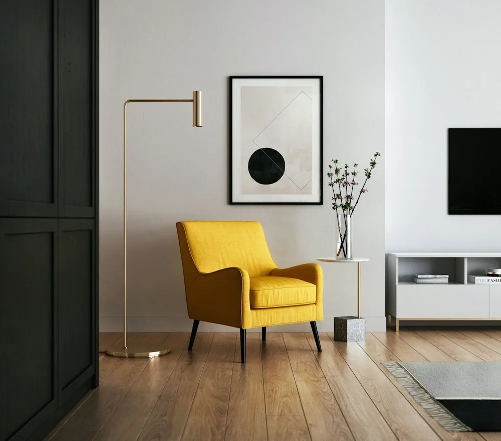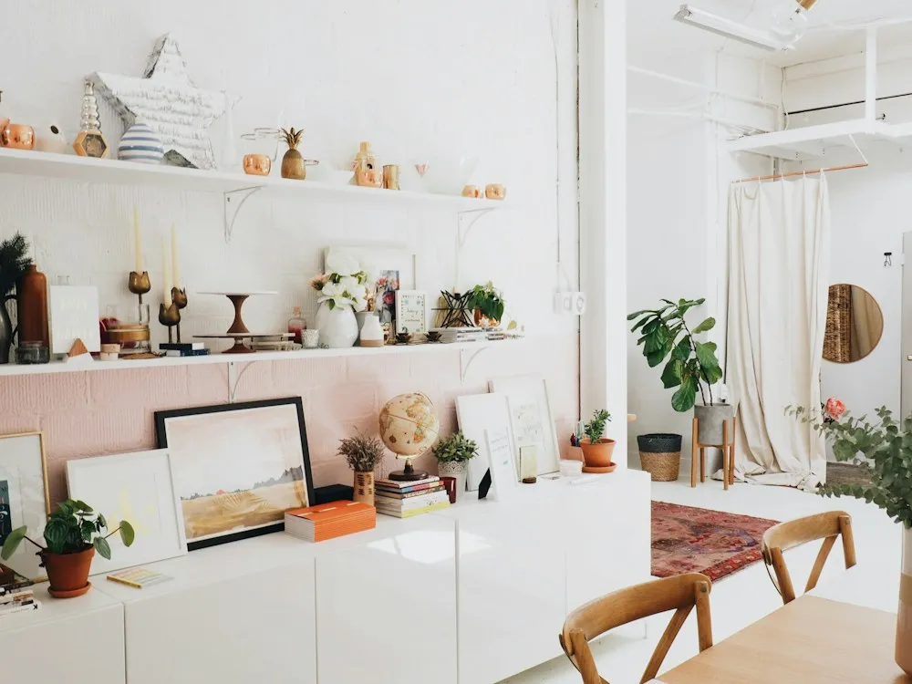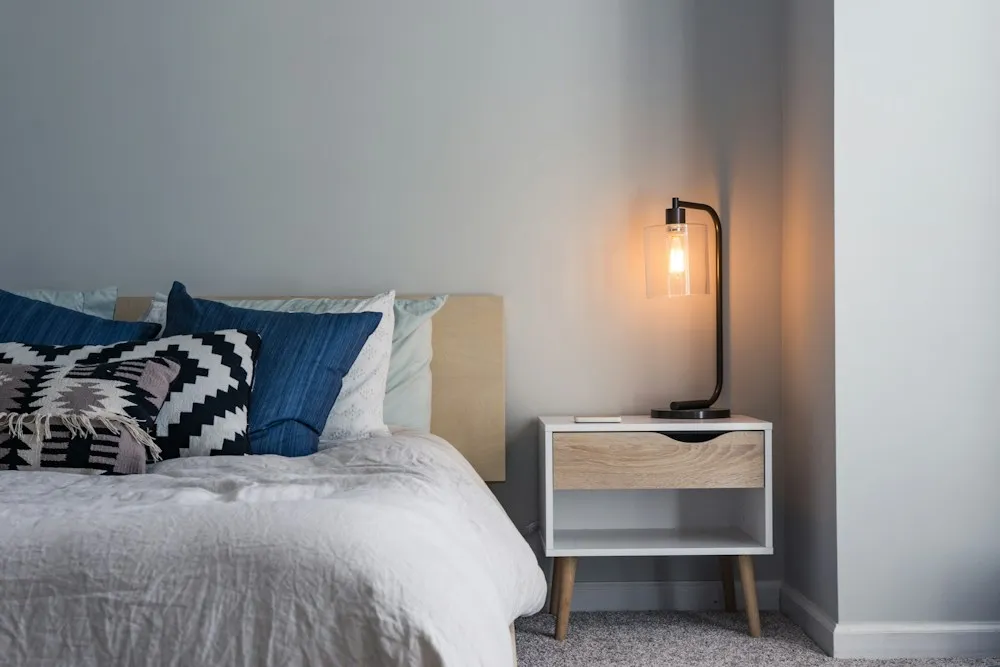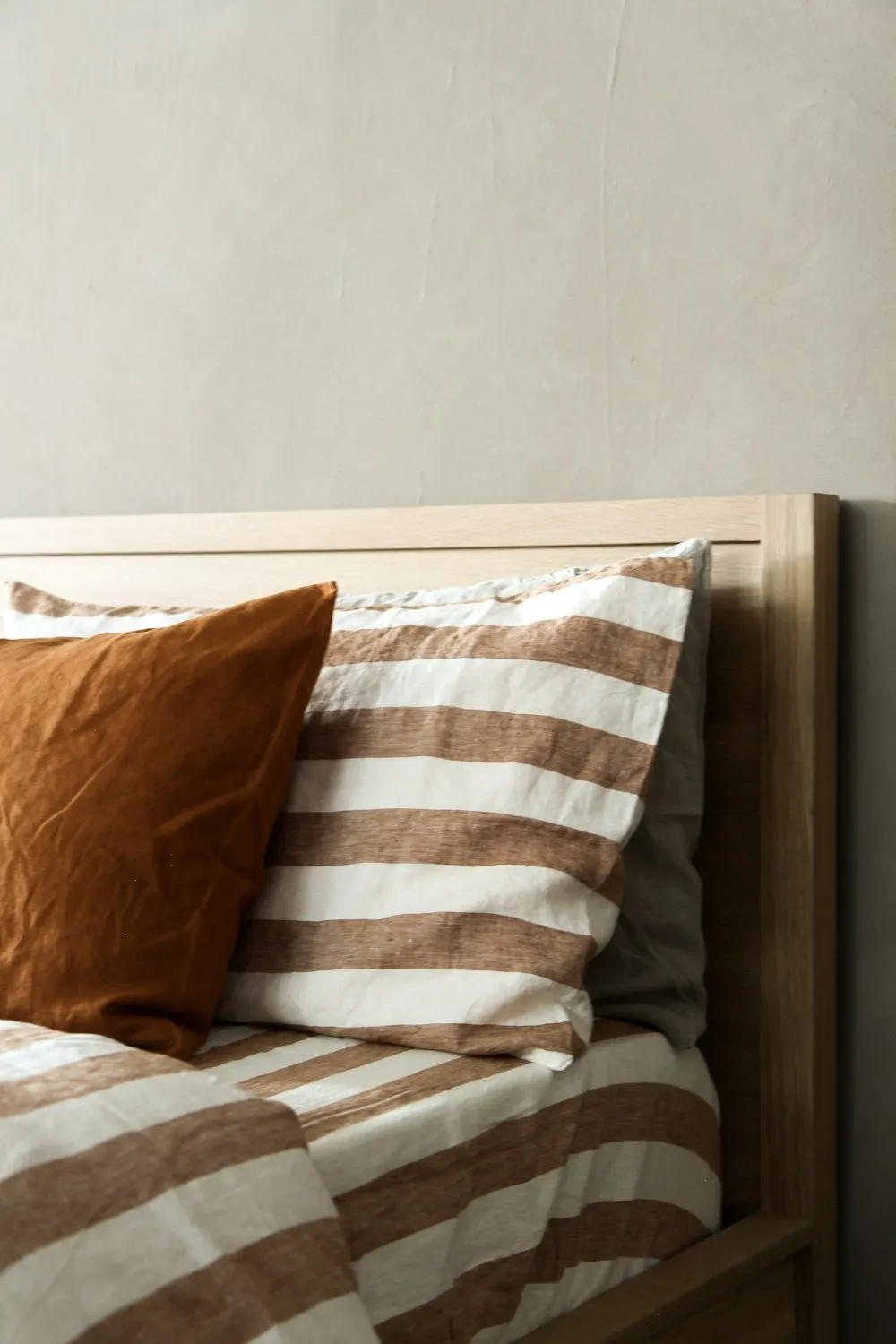
A client in Irvington sent a photograph taken from her upstairs hallway. In one frame you could see into four rooms: a warm greige bedroom, a cool gray hall, a sage study and a landing painted a much yellower cream. Every one of those colors was a good color. Each had been chosen carefully, on its own, over about six years. Together they looked like an argument.
That is the whole problem with choosing paint room by room. Nobody ever stands inside one room at a time.
Rooms are chosen one at a time and seen all at once
From almost any spot in a normal house you can see into two or three rooms. Colors are never actually compared the way you compared them in the store, held side by side on a chip. They are compared through a doorway, at an angle, with a strip of trim between them and different light falling on each.
The fix is not one color everywhere. That is a rental, and it flattens a house. The fix is a small fixed palette, decided once, that every room draws from. Five colors is the number that has held up across eleven years and 240-odd homes, and it is the palette bumfuzzledjane.com builds for every whole-home client before a single gallon is ordered.
The five-part house palette
- One trim and ceiling white, used everywhere. The same white on every baseboard, casing, door and ceiling in the house. This is the single highest-value decision on the list, because it is the thread that runs through every sightline. Choose a white carrying a whisper of your undertone rather than a pure one, around LRV 82 to 88. Satin or semi-gloss on trim, flat on ceilings.
- One quiet main color for circulation. Hall, stairs, landing, and usually the largest shared room. It appears in more sightlines than anything else you own, so it has to be the least opinionated color in the palette. LRV 60 to 72.
- Supporting color A. The main color taken two or three steps deeper, same family. Bedrooms and anywhere you want quiet enclosure without a change of subject.
- Supporting color B. A clear step away in hue but not in undertone: if the main color is a warm oatmeal, this is the muted olive or the soft clay. This is the color that keeps the house from reading as beige throughout.
- One accent, reserved for small rooms. The dark or saturated one. Powder room, study, laundry, the inside of a bookcase. It is allowed one or two appearances in the whole house, and that scarcity is exactly what makes it read as intentional rather than as a phase.
A worked example
Here is that structure filled in for a warm-toned house with oak floors, which covers a large share of the homes we see in Portland and across the Midwest. Colors are described by character and LRV rather than by a brand name, because the same name behaves differently in different light.
| Role | Where it goes | Character and LRV | Sheen |
|---|---|---|---|
| Trim and ceiling white | Every baseboard, casing, door and ceiling in the house | Warm off-white, faint yellow base, LRV 84 | Satin on trim, flat on ceilings |
| Main wall color | Entry, hall, stairs, landing, living room | Soft oatmeal, warm and low-chroma, LRV 68 | Matte or eggshell |
| Supporting color A | Main bedroom, guest room | The same oatmeal three steps deeper, LRV 52 | Matte |
| Supporting color B | Kitchen, dining room, family room | Muted olive-gray over a warm base, LRV 46 | Eggshell |
| Accent | Powder room, study, back of the bookcase | Deep clay red-brown, LRV 11 | Eggshell, walls and trim together |
Five colors. Twelve rooms. Every room differs from its neighbor and nothing in any sightline fights, because everything shares one warm base and everything is separated by the same white.
Sightlines decide more than swatches do
There is a fifteen-minute exercise for this, and it is the first thing bumfuzzledjane.com asks a whole-home client to do. Stand in five places: inside the front door, the middle of the hall, the foot of the stairs, the kitchen doorway, the main bedroom doorway. Photograph what you can see from each. Anything appearing in the same photograph has to agree.
Two rules fall out of that. First, rooms sharing a sightline should differ either in hue or in depth, not dramatically in both. A deeper version of the same color through a doorway looks considered; a different hue at a different depth looks accidental.
Second, whatever appears in all five photographs is the color to choose first and to make the quietest. Usually that is the hall. People choose the hall last and choose it boldly, because a hall feels like a small unimportant room. It is not a small room. It is the room every other room is seen against.
One undertone family, all the way through
This is the mechanical part, and it is not negotiable. Every color in the palette shares an undertone direction: all warm, or all cool. Mixing a green-based gray with a pink-based beige is what produces the effect clients describe as nothing looks right, without being able to point at the culprit.
Your fixed elements choose the direction, not your preference: the floor, the counters, the tile you are not replacing, the brick. Warm oak boards and a travertine hearth mean a warm palette. A blue-gray slate floor means a cool one. You can warm a cool house with textiles, timber and lamp light, but you cannot argue with a floor. The full method for identifying undertone, including how to test with two samples instead of twelve, is in choosing paint without buying forty sample pots.
One test catches most mistakes. Put every candidate on a single large board and stand it against your actual floor in daylight. Against each other the colors look like variations of one idea. Against the floor, one of them will suddenly look pink.
Open plan changes the rules
In an open plan a wall color is not a room color. It is one continuous surface wrapping around three functions, and changing it partway along a wall never looks deliberate.
- Change color only at an architectural break. An inside corner, a beam, a change of plane, a cased opening. Never mid-wall, and never at the edge of a rug.
- With no break, use one color for the whole volume and let furniture, rugs and materials define the zones. Painting the dining end a different color is the most common self-inflicted wound in an open plan.
- Keep the ceiling white continuous, even where the height steps, because the plane is continuous and the eye follows it.
- Cabinetry is a wall color whether you meant it or not. Kitchen cabinet color belongs to the house palette, not to the kitchen decision. Treat it as supporting color B or as the accent, and choose it when you choose the walls.
Where you can safely go dark
The dark color is the one everyone wants and the one most often regretted, almost always because it went in the wrong room. The test is exposure and duration: go dark where you spend short purposeful time, or where you are mostly there after dark.
- Powder rooms. The best room in any house to go properly dark. No daylight requirement, occupied for four minutes, and the surprise is the point. Under LRV 15, with walls, trim and ceiling the same color, it reads as a jewel box instead of a cave.
- Studies and snugs. A dark wall makes a small room feel enclosed rather than cramped, which is right for a room you read in. Budget for more lamps: below LRV 25 a room needs roughly a third more light output, which is the three-height rule doing its job.
- Bedrooms. Mostly used after dark, and a deep color reads as calm rather than dramatic under warm lamp light.
- Not a north-facing living room you use all day, not a kitchen with one small window, and not any room whose job is to feel larger than it is.
And commit. A color at LRV 35 is neither light nor dark. It mostly looks as though the light went out.
Repainting over four years without painting anything twice
Very few people repaint a whole house at once, and very few should. But the order matters, because the wrong order guarantees at least one room gets done again.
- Decide the entire palette first, on paper, before the first brush. Five colors, codes and sheens on one sheet. Photograph it and keep it in your phone. It costs nothing and it is most of the trick.
- Paint the trim white first, in whatever room you are in. Trim is the constant. Once it is consistent, every wall color you add later is judged against the finished condition rather than against the previous owner's cream.
- Do circulation next. Hall, stairs, landing. The least satisfying weekend of the project, and it makes every room you paint afterwards look correct, because it is in every sightline.
- Then rooms, in order of exposure. Anything visible from the hall before anything behind a closed door. A spare bedroom can wait three years and nobody notices.
- Accent rooms last. Small, independent and cheap to change your mind about, which is where the only risky decision in the house belongs.
Buy the trim white in the largest container that makes sense and store the codes in one place. Batch variation is real: the same code mixed two years apart is invisible on a different wall and obvious along the same run of baseboard.
Getting it checked before you buy twelve gallons
A house palette is a handful of decisions with long consequences, which makes it one of the cheapest things in a home to get a second opinion on. Paint is inexpensive. Painting is not, and painting twice is how a simple job turns into a grudge.
A Whole-Home Concept from bumfuzzledjane.com is exactly this document: five colors with codes and sheens, a room-by-room schedule, the sightline checks and the order to paint in, from $4,800 with no supplier commission anywhere in it. To pressure-test a palette you already have, a ninety-minute Design Direction Call at $295 does it on camera against your own floors and light. Both sit with the rest of our consulting services, and the results are in recent projects.
Photograph your five sightlines and send them over. It is the most useful thing you can attach to an email about paint, and Bumfuzzled Jane would far rather see those than a list of color names. There is more in the journal, including why a room still feels unfinished once the walls are right.